


English


Paperback
₹1568
(All inclusive*)
Delivery Options
Please enter pincode to check delivery time.
*COD & Shipping Charges may apply on certain items.
Review final details at checkout.
Looking to place a bulk order? SUBMIT DETAILS

Piracy-free

Assured Quality

Secure Transactions
About The Book
Description
Author
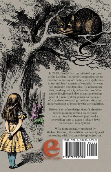
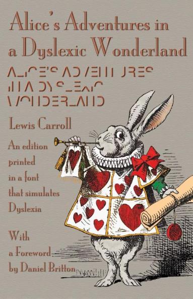
In 2013 Daniel Britton initiated a project at the London College of Communication to recreate the feeling of reading with dyslexia-to try and instil a sense of empathy between non-dyslexics and dyslexics. To accomplish this he designed a typeface that would be almost illegible and slow down the reading pace of a non-dyslexic person to the speed of a dyslexic recreating the frustration and embarrassment of reading with the condition. Brittons typeface design doesnt simulate letters jumping around on the page or anything like that-it just breaks the reading time of a non-dyslexic down to the speed of a dyslexic. With fonts specially produced by Michael Everson this edition has been typeset in keeping with Brittons design objectives.
Piracy-free
Assured Quality
Secure Transactions
Delivery Options
Please enter pincode to check delivery time.
*COD & Shipping Charges may apply on certain items.
Review final details at checkout.
Details
ISBN 13
9781782011293
Publication Date
-25-09-2015
Pages
-156
Weight
-192 grams
Dimensions
-140x216x9.18 mm
